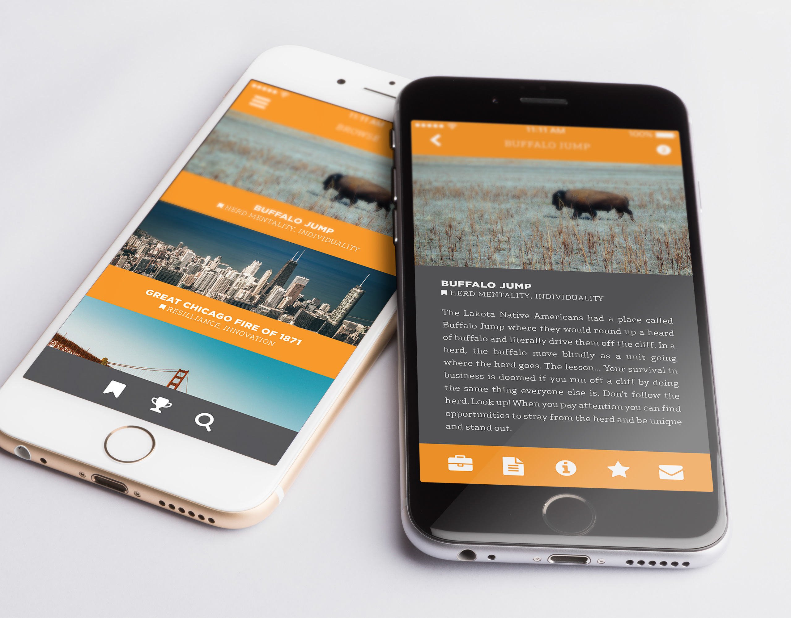
Overview
Clearwater Analytics is a rapidly growing SaaS software company which provides an investment accounting and reporting platform to institutional investors. As the sole Web Designer on the Marketing team, one of my primary projects was to redesign cornerstone features of the public facing marketing property to grow marketing qualified leads (MQLs) by 30% — namely demo requests.
An analytics audit and expert review of Clearwater's website user flow lead to strategic changes in the site's design yielding a 44% increase in organic demo requests, $240k in attributed campaign revenue, and $1.2M+ in the sales pipeline.
The Process
Understand the customer
Visitors of the site want to learn more about Clearwater, so they reach out to have someone take them through a product demonstration.
An audit of legacy website visitor data shows us visitors engage with several pages across the site, but demo requests occur mainly on the homepage. Those requesting demos do so via a form located in the site's footer, often located thousands of pixels below "the fold." Scroll-mapping shows only 20% of visitors moving down the page far enough to see it — on any page.
The current primary action on the site is 'Login' which is taken by roughly 45% of the site traffic, but isn't applicable to interested customers.
Identify the problem
Site visitors who want to request a product demonstration don't reach out frequently because a way for them to do so isn't easily discoverable.
Ideate solutions
How might we make it easier for site visitors to request a product demonstration?
Add 'Request Demo' button to site header
This simple addition would make requesting a demo highly discoverable on every page that displays the site navigation header — a clear primary action which aligns to the visitor's goal.
This simple addition would make requesting a demo highly discoverable on every page that displays the site navigation header — a clear primary action which aligns to the visitor's goal.
Add 'Request Demo' button to homepage hero section
The user's primary goal in the hero section is to learn more about Clearwater, but is not presented with a readily available secondary option to take action and request a demo if they are convinced that Clearwater would be a good fit for them. Including this second button could provide a visitor a more direct pathway to success.
The user's primary goal in the hero section is to learn more about Clearwater, but is not presented with a readily available secondary option to take action and request a demo if they are convinced that Clearwater would be a good fit for them. Including this second button could provide a visitor a more direct pathway to success.
Add Site-Wide Notification Banner above site header
Information about Clearwater events, and other conversion magnets are often below the viewable area of the website. This information is also frequently isolated to single pages. By pulling these items out and promoting them at the top of every page in a Notification Banner we make it easier for the visitor to quickly gain access to important information and get one step closer to becoming an MQL (Marketing Qualified Lead).
Information about Clearwater events, and other conversion magnets are often below the viewable area of the website. This information is also frequently isolated to single pages. By pulling these items out and promoting them at the top of every page in a Notification Banner we make it easier for the visitor to quickly gain access to important information and get one step closer to becoming an MQL (Marketing Qualified Lead).
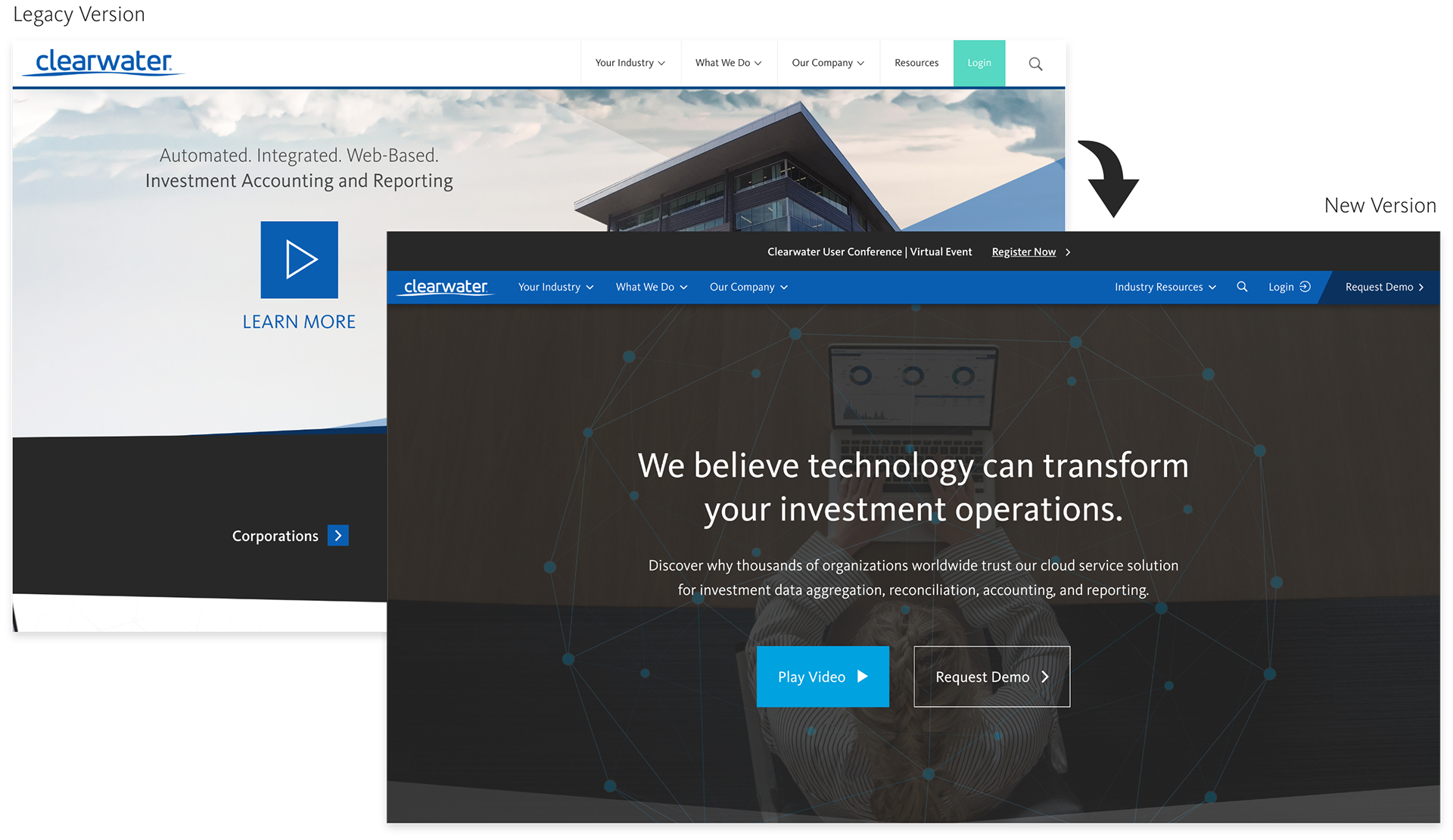
Legacy Clearwater homepage (left) compared to refreshed homepage (right).
Homepage Hero Redesign
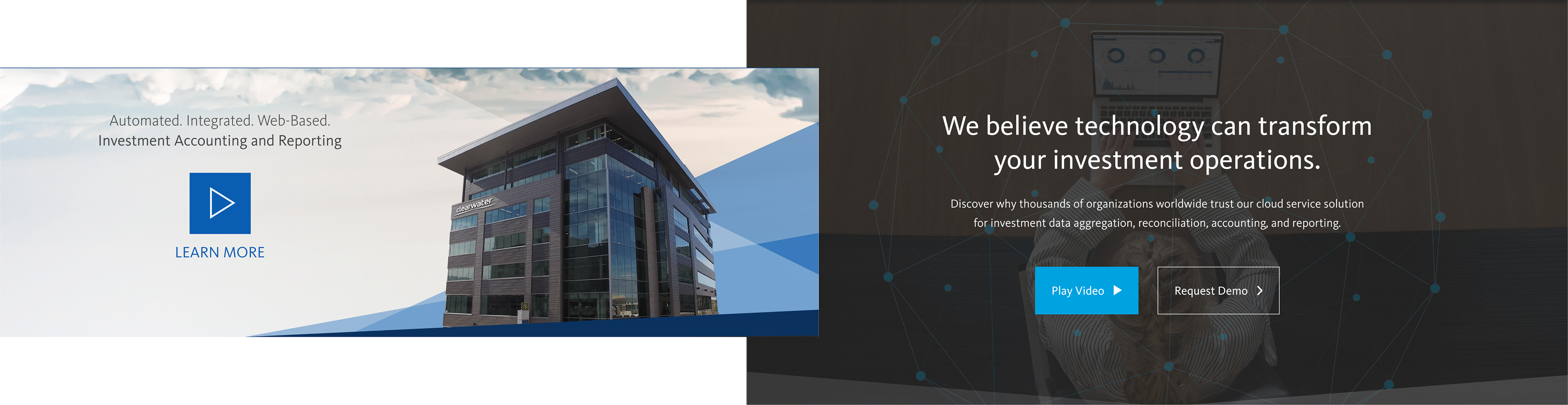
Legacy homepage hero section with company headquarters and video play button (left) compared to redesigned section with new copy and brand imagery (right).
The hero section of the legacy homepage prominently featured a photo of the company headquarters with copy that communicated the core value propositions, but failed to connect with visitors on an emotional level.
The new page utilizes subtle brand imagery featuring a person using the actual software, along with copy designed to connect to the visitors drive to transform investment operations at their company.
Research shows that a positive emotional decision takes nano-seconds to impress itself on a person, and can bias a logical decision just because "it feels right."
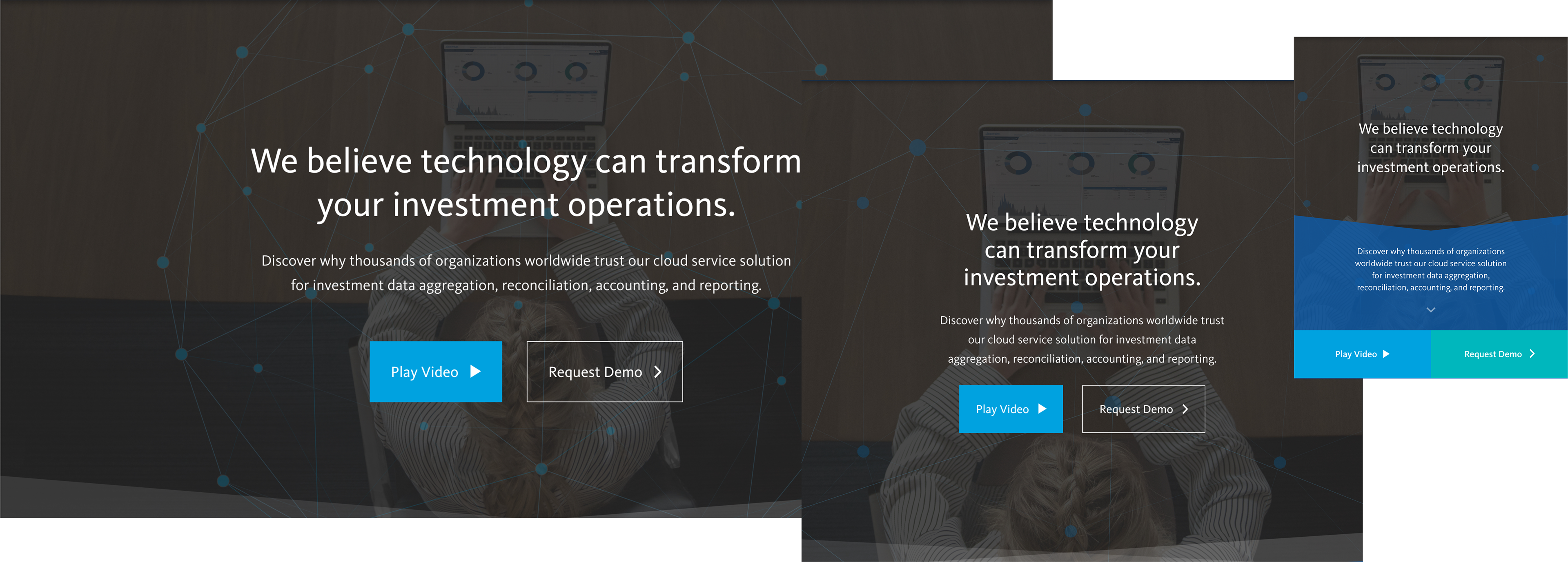
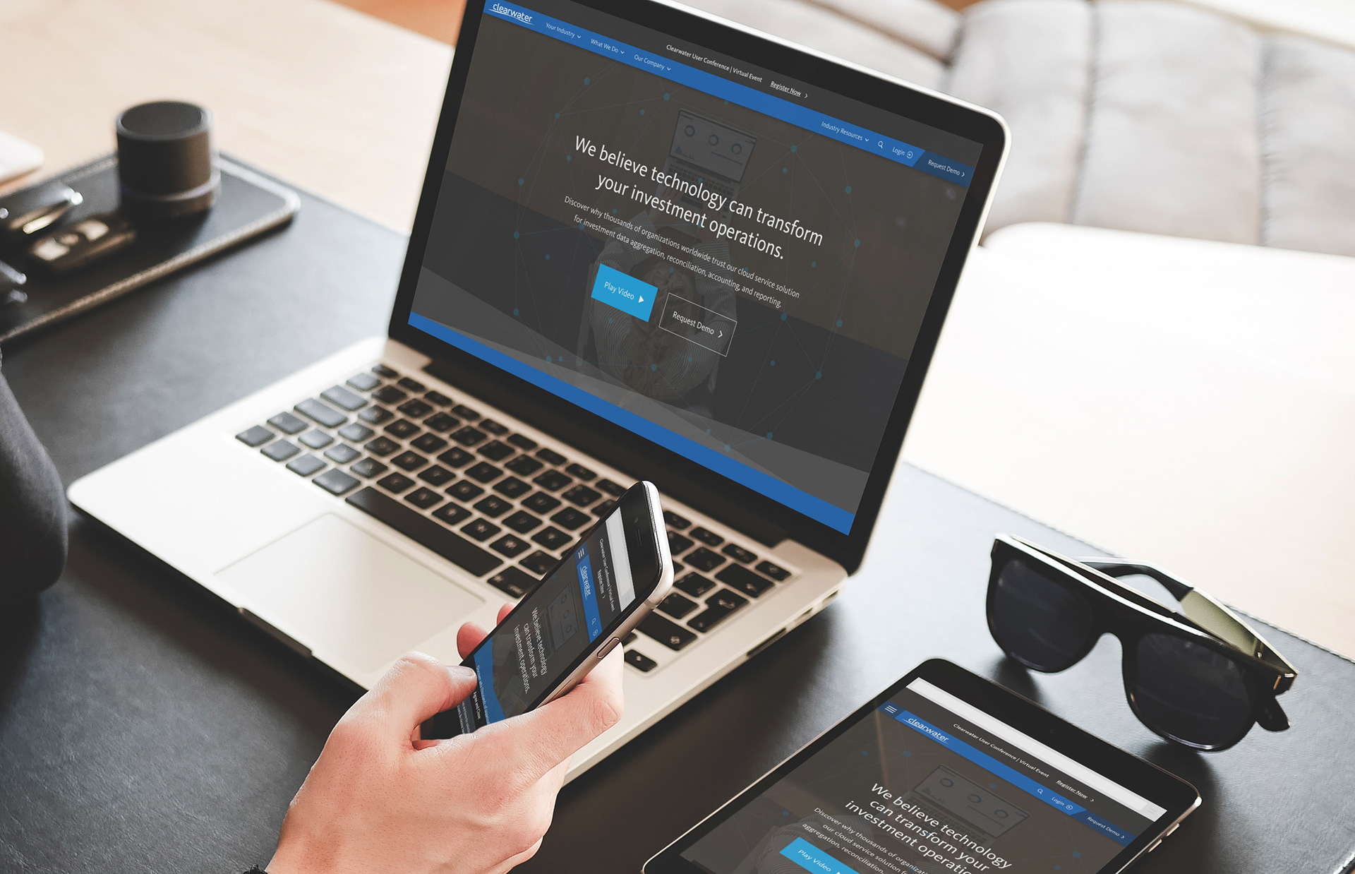
The homepage hero section is designed with responsiveness in mind. Desktop (left), Tablet (center), mobile (right).
Results
This new design resulted in higher video engagement and directly contributed to exceeding the MQL goal for demo requests in 2019. The imagery from this design extended to other digital platforms around the company, including the default background image for the Zoom Rooms which hosted meetings with clients.
Header Redesign
When evaluating user data, we found majority of visitors browsed the legacy site using the primary navigation and footer. They visited a core set of informational pages however, almost all users failed to complete the 'Request a Demo' form.
When we further analyzed the shared structure of the site we discovered the navigation was persistent on almost all site pages, but its primary call-to-action (CTA) was for existing clients to login. It was also found that the footer contained unnecessary content and could benefit from consolidation.
The visual updates to these components reflect Clearwater's evolving brand which later influenced other digital expressions and the Northfork Design System.
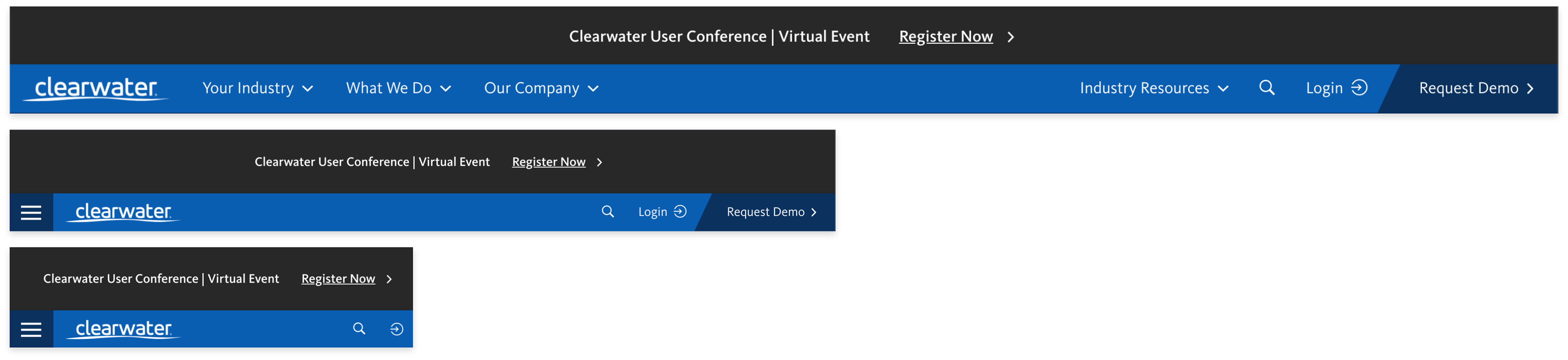
The new header stack featuring a notification bar, page navigation, and call-to-action (CTA). Displayed in responsive breakpoints desktop (top), tablet (mobile), mobile (bottom).
The new header design introduces new site-wide touch-points to connect visitors with news, events, thought-leadership, and the sales team.
Outcomes
The introduction of the 'Request Demo' button allowed for a visitor to engage the sales team from anywhere on the site, resulting in 44% year-over-year growth in organic demo requests through the website.
The introduction of the notification banner created an uptick in User Conference registrations and allowed the company to easily share reports on stellar system and operations performance during the onset of COVID-19.