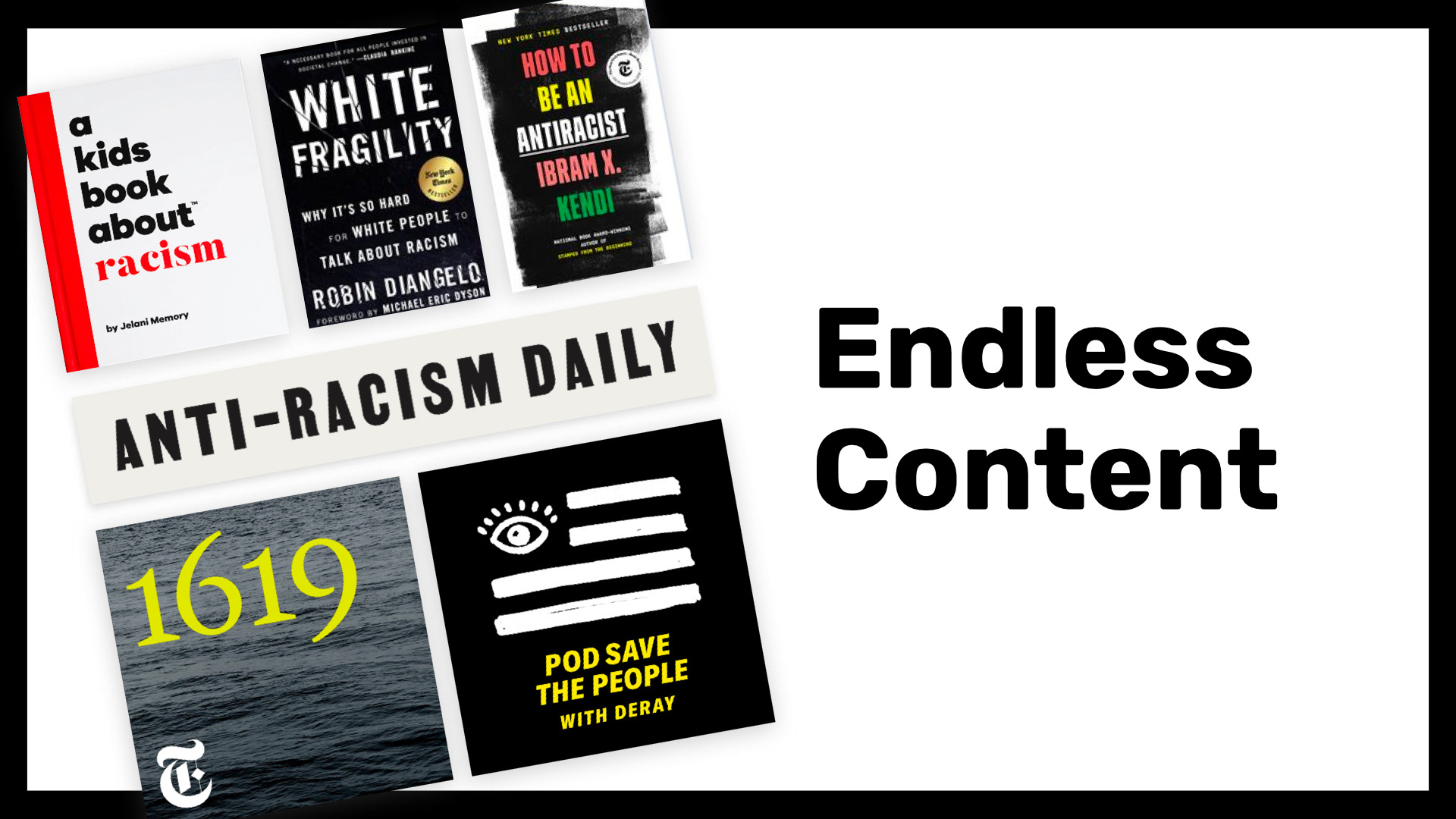
Some of the 74,500,000+ resources on anti-racism include A Kids Book About Racism, White Fragility, How to Be an Anti-Racist, The Anti-Racism Daily email newsletter, the 1619 podcast, and the Pod Save the People podcast.
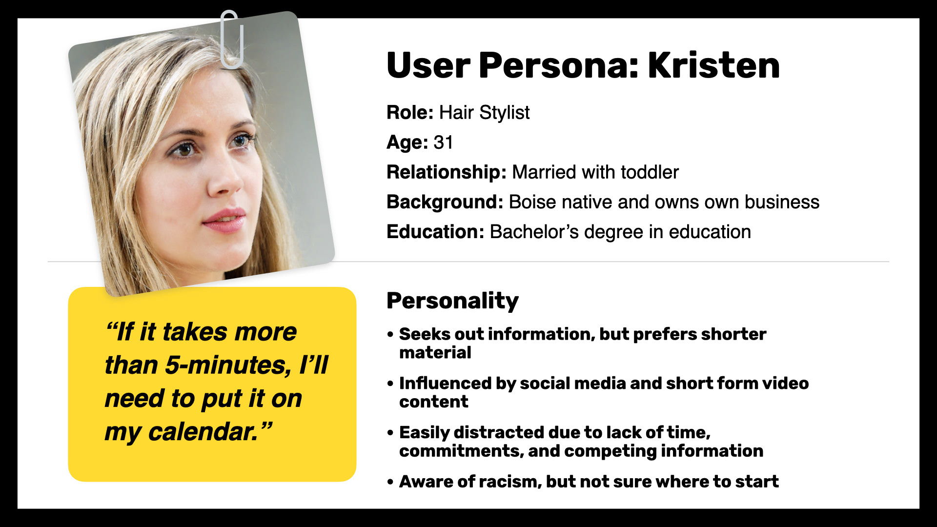
Kristen is a 31-year-old hair stylist. She is married with a toddler and runs her own local business. She is college educated and lives in Boise (a majority white city in the Pacific Northwest). Her personality traits indicate that she prefers short-form educational content.
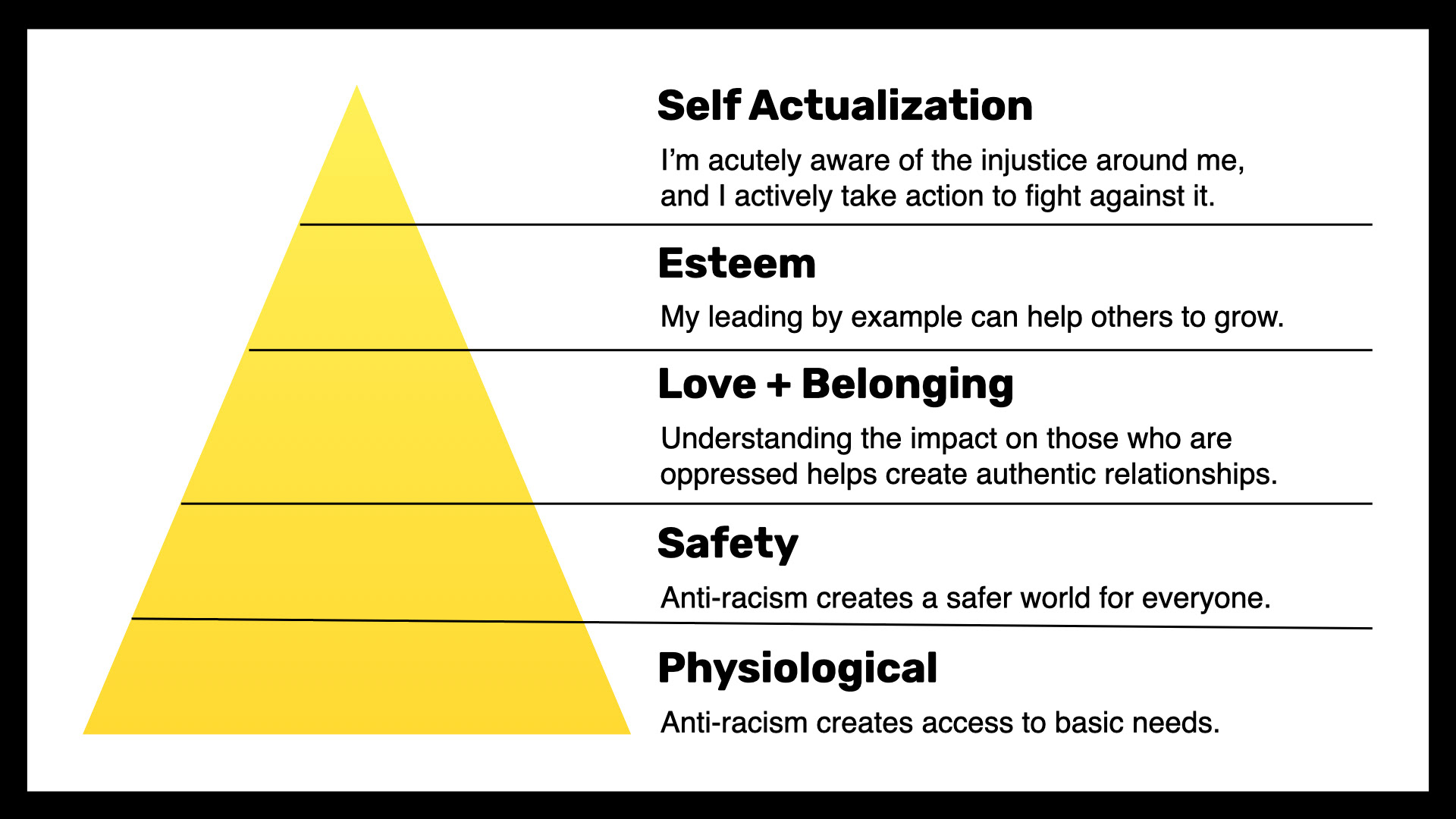
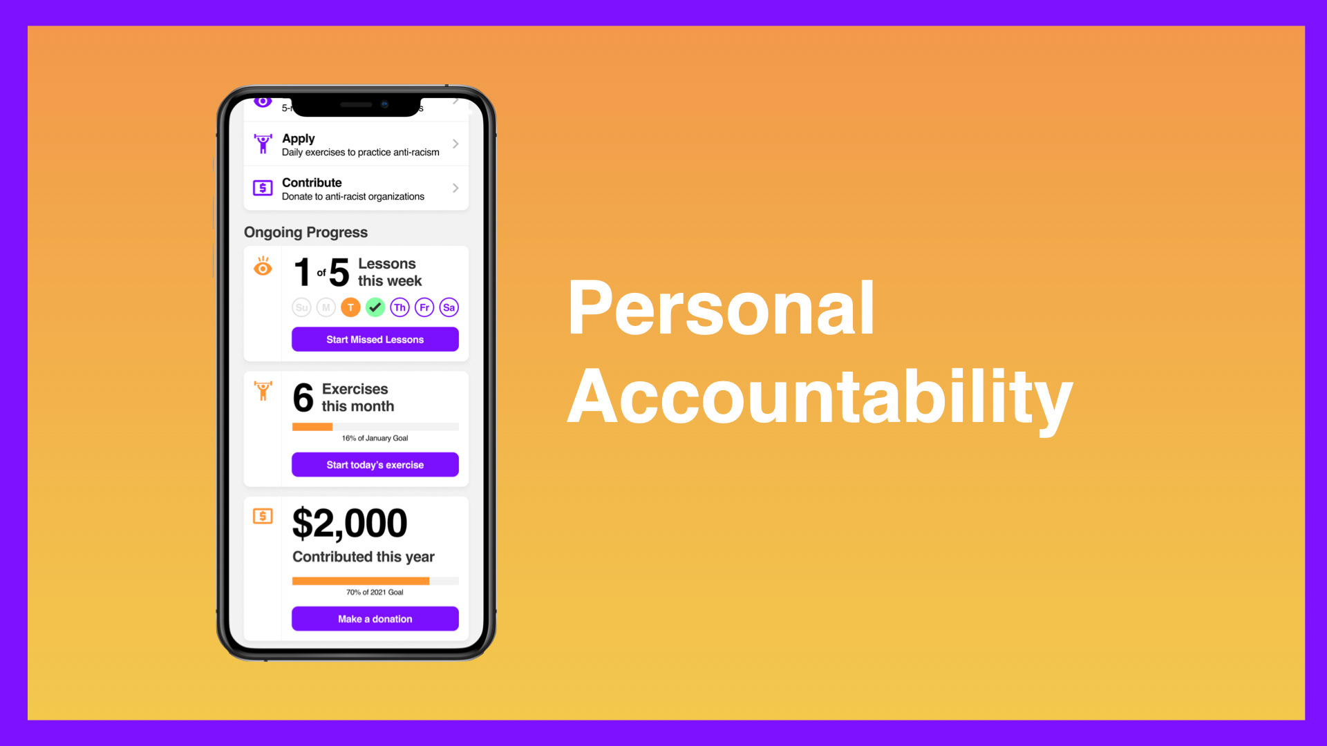
Anti-racism impacts nearly every level of Maslow's Hierarchy of Needs, indicating this app could benefit users on almost every level allowing for significant personal growth.
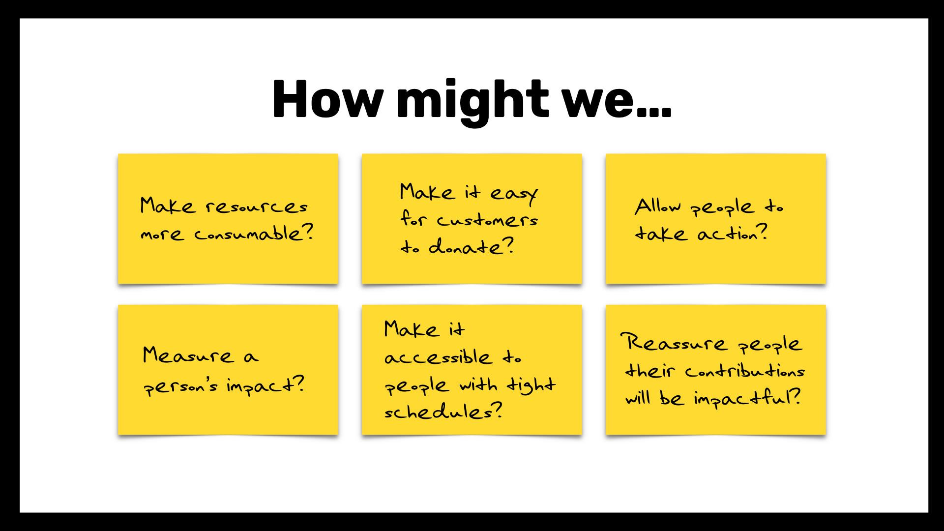
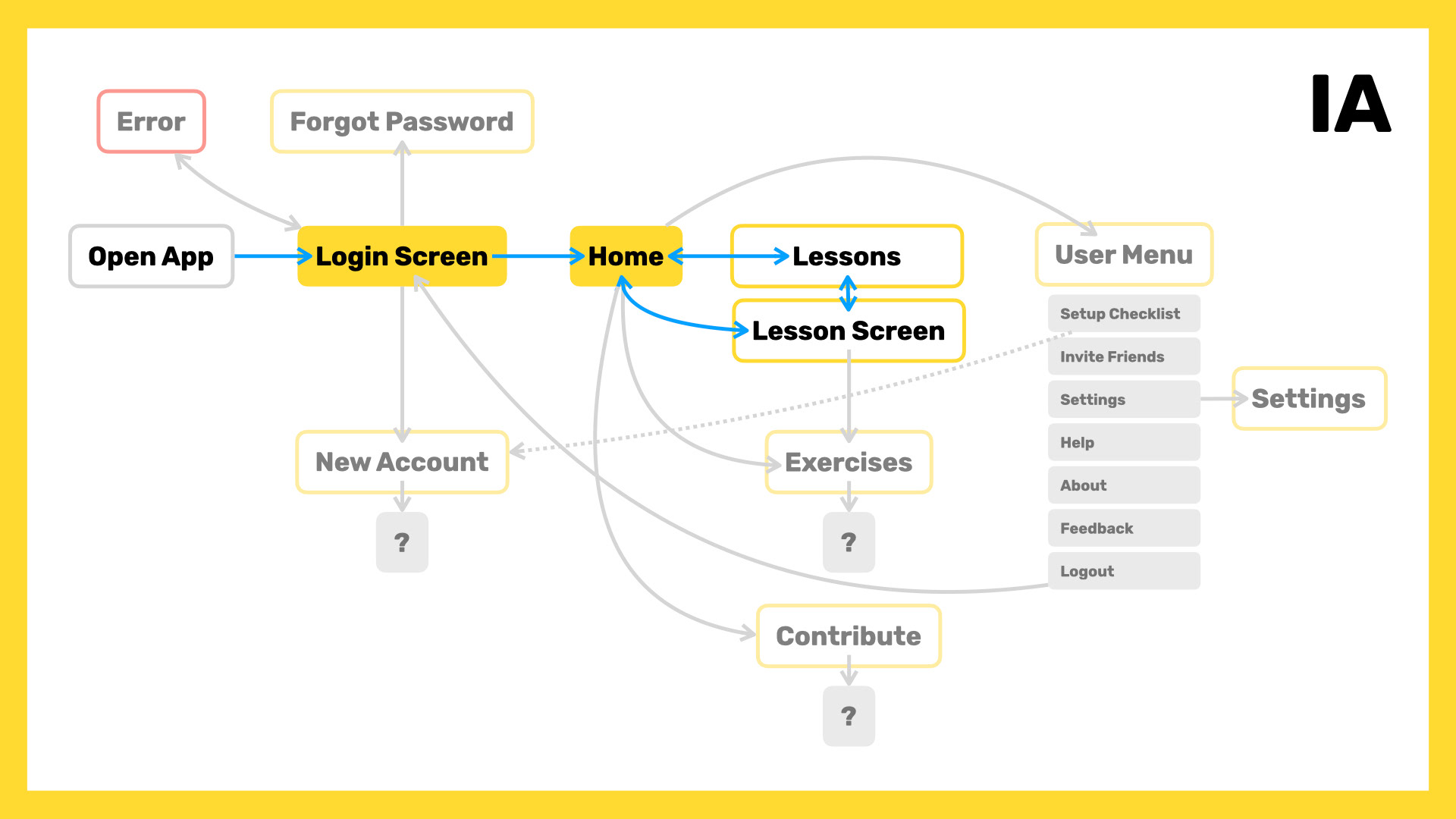
Several "How might we..." ideas that were eventually paired down to a single HMW that shaped the design prompt.
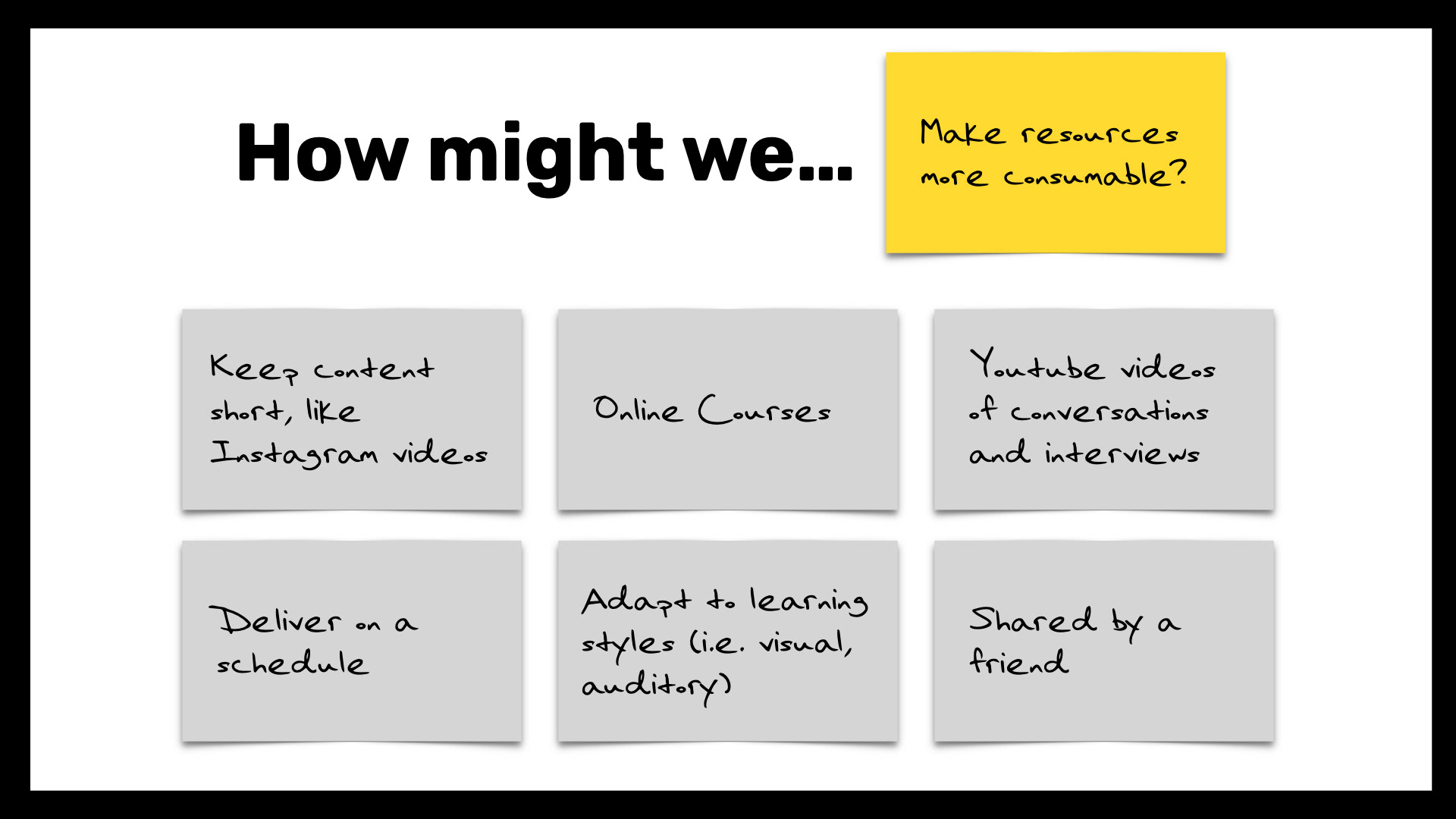
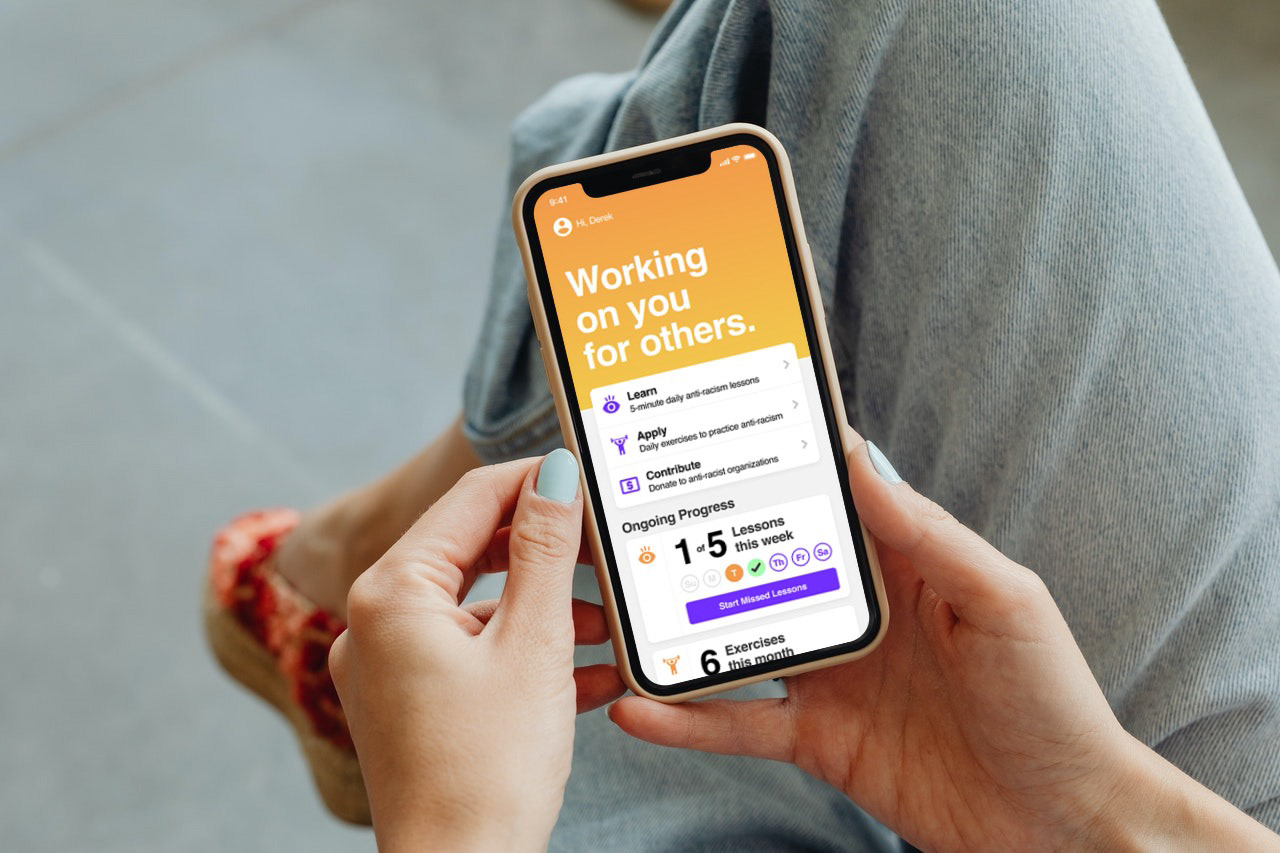
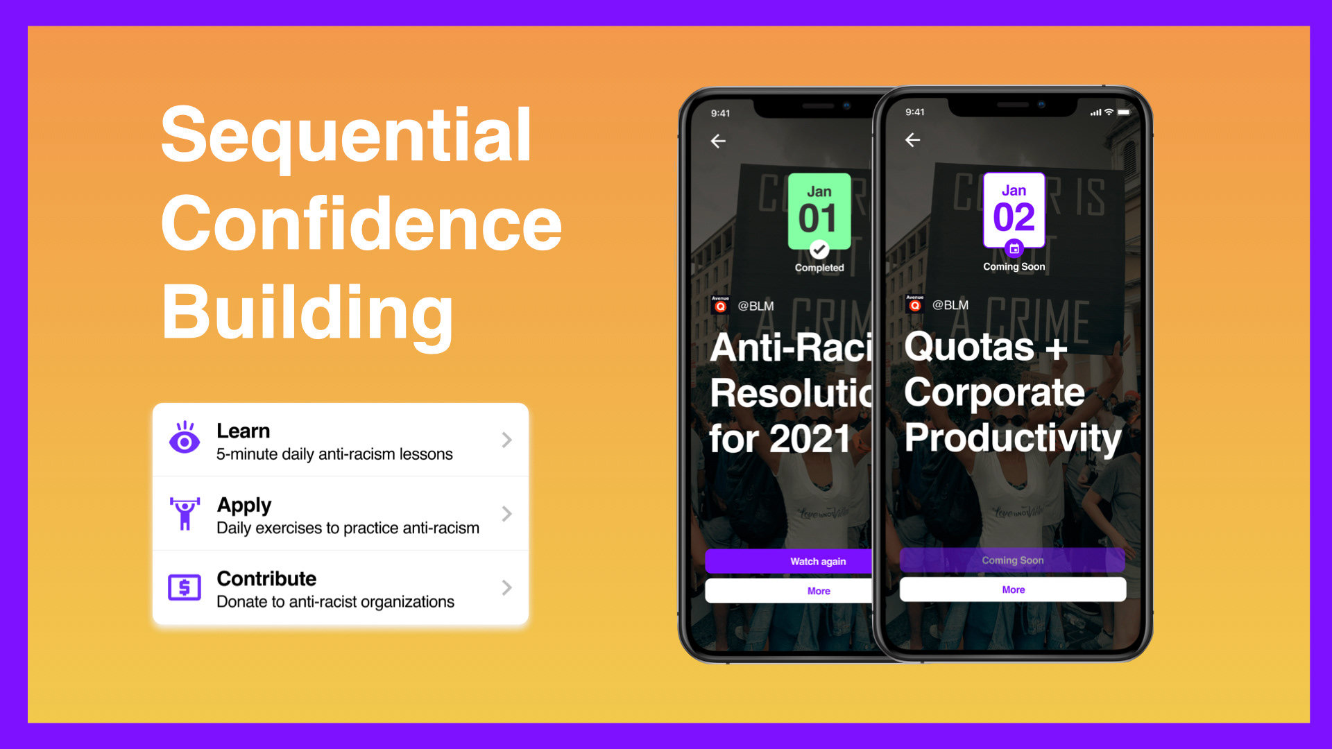
How might we make resources more consumable? Deliver on a schedule.

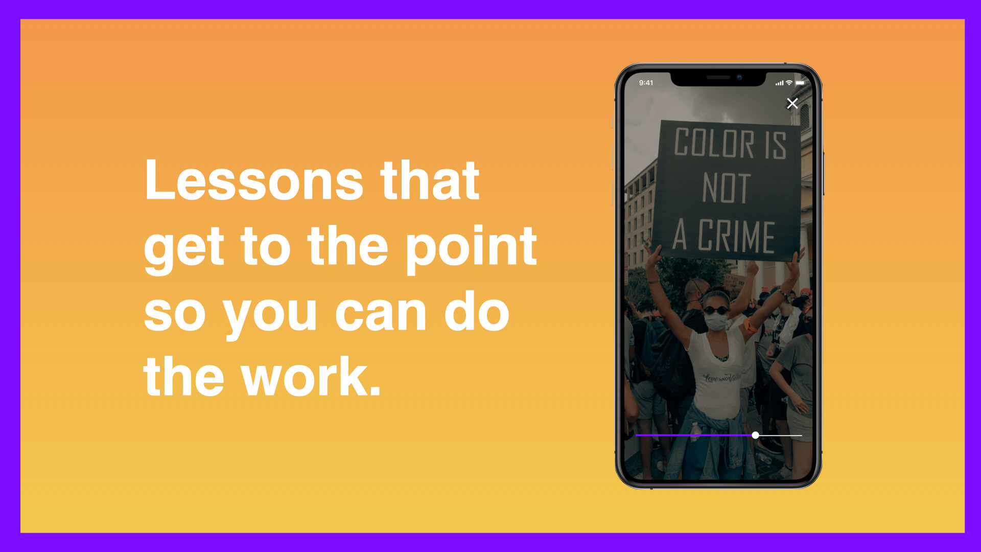
A small dose of content each day can improve a person’s anti-racist perspective. Each dose is a short form video lessons on topics like racial history, systemically racist policy, empathy, or current events — each lasting no longer than 5 minutes.
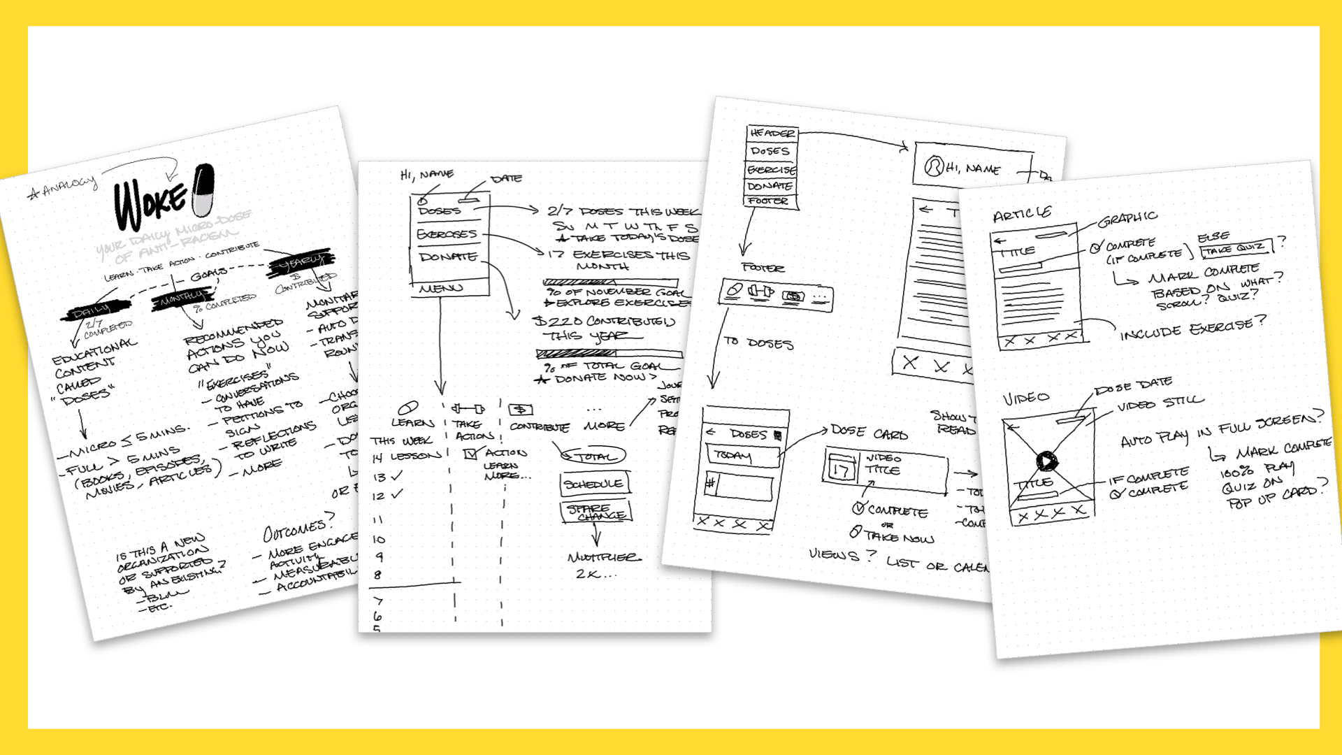
Sketches for the Woke App including core concepts, early user flows, and screen features.
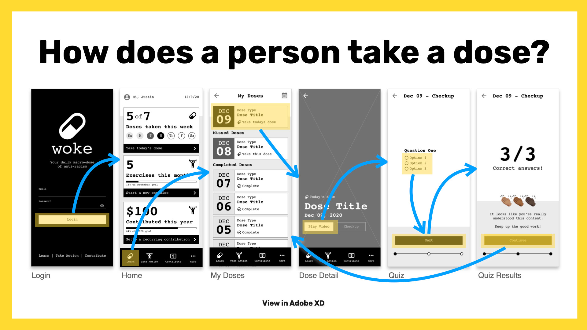
This is the happy path for a user that wants to view their daily video lesson.
View the interactive prototype built in Adobe XD.
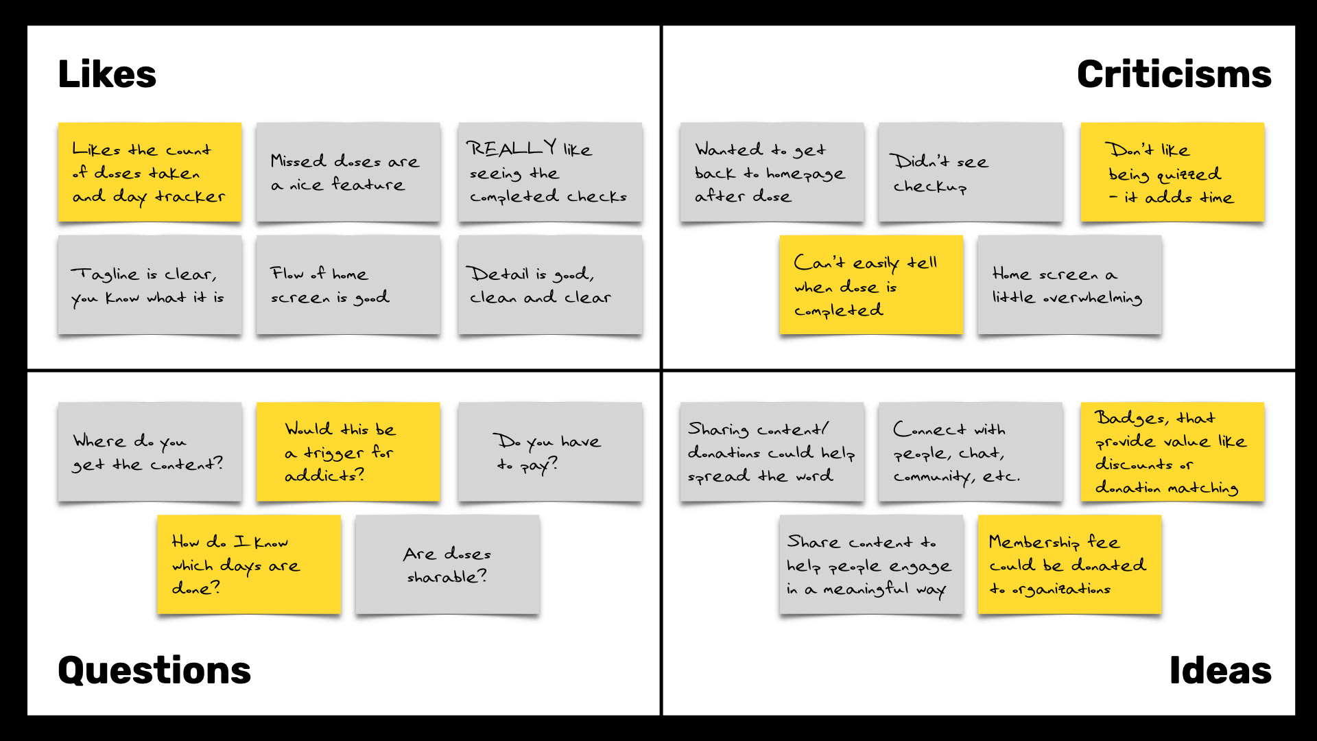
Feedback Capture Grid for the Woke App's testing process features user thoughts including likes, criticisms, questions, and ideas.
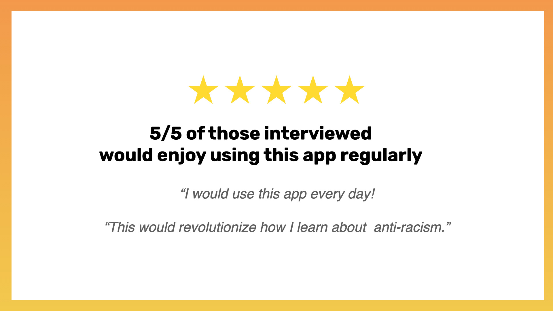
5/5 of those interviewed would enjoy using the Woke App regularly. Quotes included: "I would use this app every day!" and "This would revolutionize how I learn about anti-racism."